
Old Logo, New Look
Sometimes a client will come in with an existing logo to use on their business cards and website. And sometimes, they need little convincing to realize that the collateral and marketing materials they’re about to drop money on will be better served by a more professional looking logo.
In some cases, this means starting over. But many small business owners will, not unreasonably, have a personal and/or sentimental attachment to the logo they went with (sometimes a logo they created themselves) when they first got started. In the happiest of these particular scenarios, the client sees the benefit of and agrees to a logo facelift. (In the UNhappiest of these scenarios, we do the best we can to use the existing logo in a flattering way.)
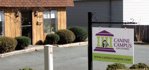
A short time ago, we were talking with the owner of Canine Campus, the talented folks who were helping our beloved hound Lucy work through her fear issues. We got onto the topic of business, and she told us that she was moving to a new facility and would need a sign to help people find her new location. Naturally, we perked right up. She had a logo, but felt that the time had come to a) add some color (huzzah), and b) have it look a little more polished. Again, huzzah.
Her logo featured a Husky and a simple building facade with bones for columns. Both features were non-negotiable, but she was open about how they might be depicted. Here’s how it started out…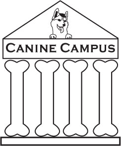
I knew right away that the dog would have to be bigger – even in large formats, the dog is all but invisible compared to the large structure it’s in. I also wasn’t keen on the placement of the dog, and thought we should bring it closer to the ground. I knew I wanted rounder edges and a more compact vertical footprint.
She told me that the colors should be lime green and purple. I usually try to steer clients away from what many seem to regard as an edgy (if not revolutionary) combination of green and purple. In my opinion, it’s a seriously overused scheme. She was set on those colors, though, so I went with it. After a few rounds, she was happy with our redesign…
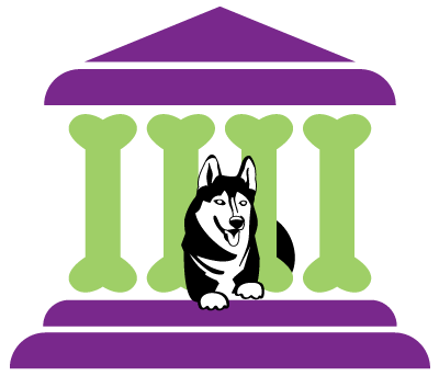
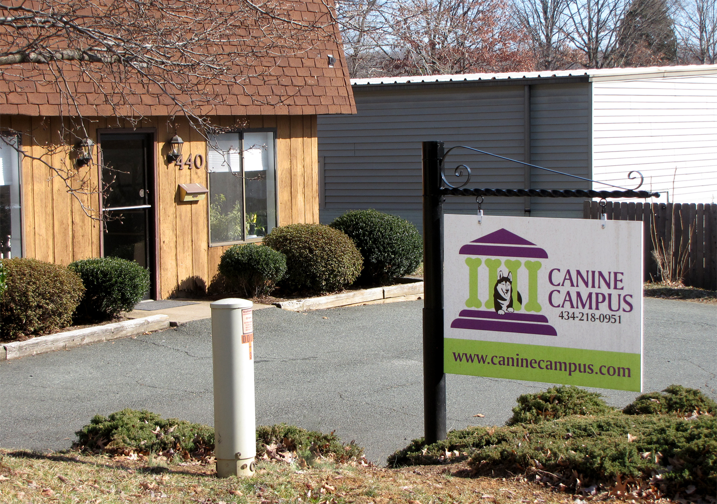
We decided that incorporating the company name within the boundaries of the logo added way too much clutter, so we offered versions with the name placed under the building and also to the right of it. Both work well, and allow for a variety of layouts, including the sign that now greets her customers at her new location:
Is it a design I would’ve come up with had I started from scratch? Probably not – but sometimes working with strong client inputs limits endless revision churn, and can (and did) leave the customer feeling as if she was staying true to her original vision for her logo and for her business. Everyone walks away feeling warm and fuzzy – and what’s wrong with that?
So – do you have a logo that is near and dear to your heart, but needs a little cosmetic help? Give us a shout.
[Tweet “Old logo, new look – the upside of logo revision #whistlecorps”]